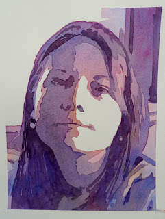
This is a line drawing using the hatching technique from which I am going to paint a watercolour, using traditional washes.
It's an ideal drawing to use because the light is directional so my tonal contrast will be strong.
I have decided to use traditional washes.
This can be likened to transparent layers of coloured tissue paper placed one on top of another, where they overlap, the upper most being the most dominant colour, but the underlying washes creating to the overall impact.
I've selected 3 primary colours.
Using my Classic Round number 12 brush.
On Bockingford watercolour paper 140lb
I use masking tape to create the edge of my intended painting, (I shall peel this off at the end).
Looking carefully at my drawing I intend to cover the entire sheet of paper with a light tonal value, leaving dry the white areas where the light falls on the figure.
This is a varied wash. In other words, I vary the colours as I go, beginning with the blue (top right) working down the page, adding red. Dropping in a little of the yellow.
The challenge is to retain all the colours allowing them to merge a little without them all mixing up and creating a muddy grey.
This needs to dry.
Using the same colours I am now going to lay another wash leaving some of the previous wash unpainted. (this will suggest a lighter tone)
I try not to paint the same colour on top of the previous one, making sure the subsequent washes are different adds to the 'tissue paper' effect and creates a certain lumonocity.
Painting blue over pink now makes a glowing purple, yellow over the pink, a soft orange.
This can be so exciting as the result is only really evident once the wash has fully dried.
This needs to dry.
The next wash is going to look more dramatic as it becomes darker.
I think this is my favourite stage when it all starts to come together.
I should just say that transparent colours work best for this technique. If the colours are opaque it all becomes a bit dull quite quickly.
This third wash of colour takes more time as I think carefully about what not to paint. This means that the wash must be very wet allowing me time to build up the painting.
Notice that when I get to the under side of the chin, where I am dropping in some yellow onto the purple, the top of the forehead is still wet.If I wanted to drop more colours there, I still could.
This is how it looks when this stage dries. Its starting to take shape now, but there are still some details I need to add.
In some ways I rather like it at this stage. There is a certain abstract quality about it which appeals to me.
Once I have added another stage, it will be interesting to see if I should have stopped now!
At this stage it reminds me of those 60's Pop Art images. This on a big canvas would be rather nice.
This photo is a bit bright as the lighting changed, but it does clearly show you how much darker this last wash is.
The wash uses the same colours again, but I tend to use more of the blue and red, with just a touch of the yellow to give me a deep purple.
I am no looking for any of the really dark areas. The tiny bits of dark that seem to stand out.
And this is how it looks when I have finished the whole wash.
This dark is very dark suggesting where the hair and neck line are, and details such as the ear rings suddenly appear.
This was a total of four washes.
A softer result could have been achieved had I kept all of mtyedges soft, but this would have appeared more 'photographic' which I didnt want.
I still like it after the third wash, although I would always feel that it needed 'just that little bit more'


No comments:
Post a Comment